Lönngren Automation
A logo where organic endurance meets mechanical precision.
- Client
- Lönngren Automation
- Services
- BrandingLogo designVisual identity
- Industry
- Manufacturing

Context
Lönngren Automation takes existing assembly lines and machinery and makes them run smarter. The company needed a logo that works as hard as it does, on screen, on workwear and out on the factory floor.
Problem
The name pulls in two directions. Lönngren comes from lönn, the maple: organic, alive, built to last. Automation is mechanical and exact. The mark had to hold both without becoming a literal leaf next to a gear, and stay clear enough for embroidery, reflective print and the smallest sizes.
Solution
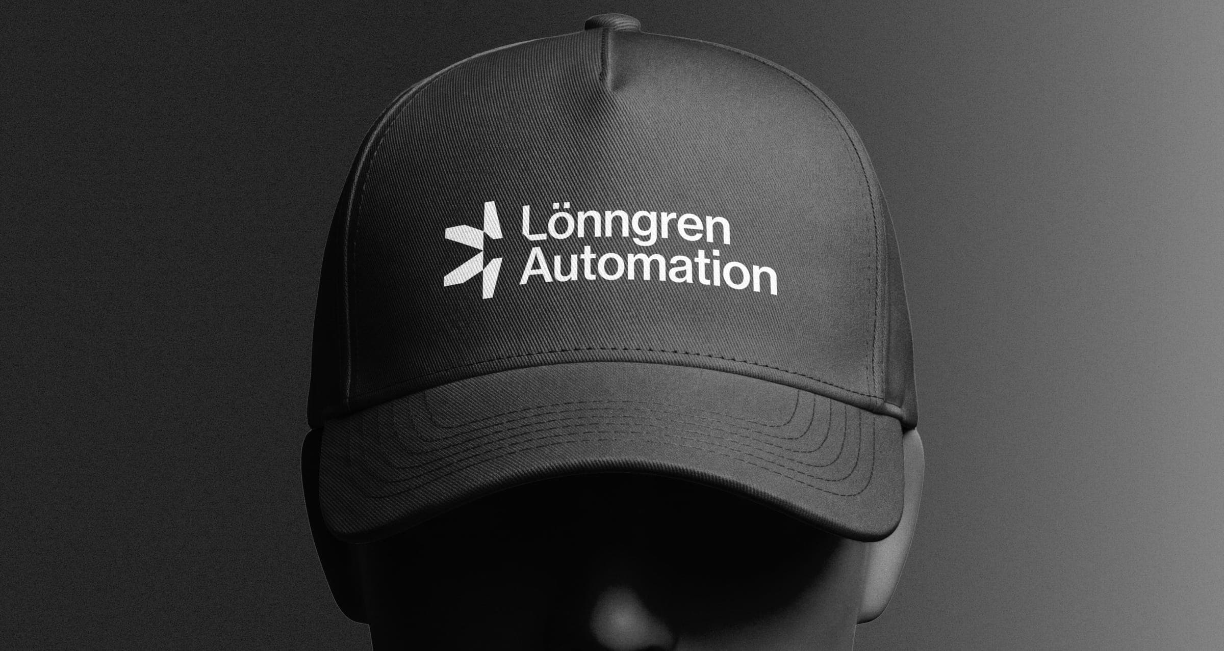
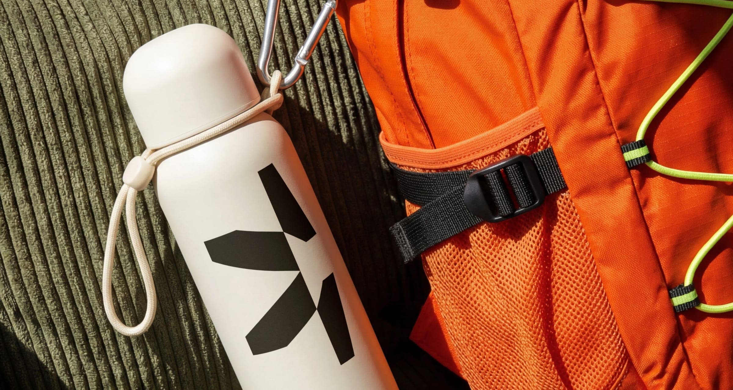
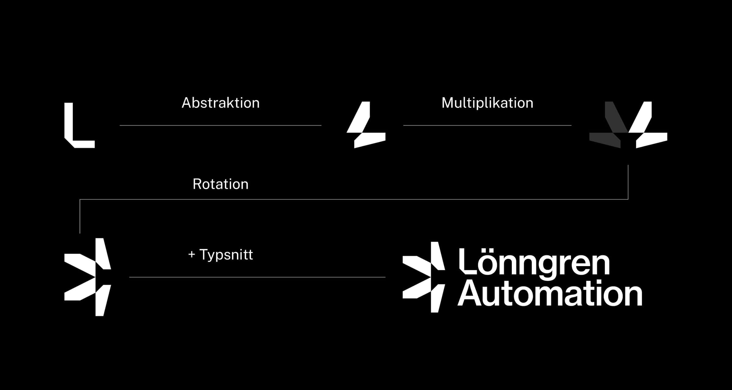
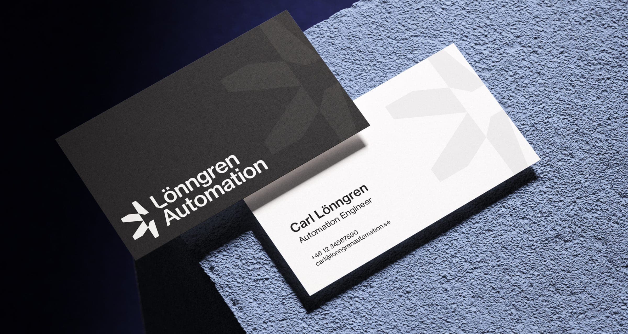
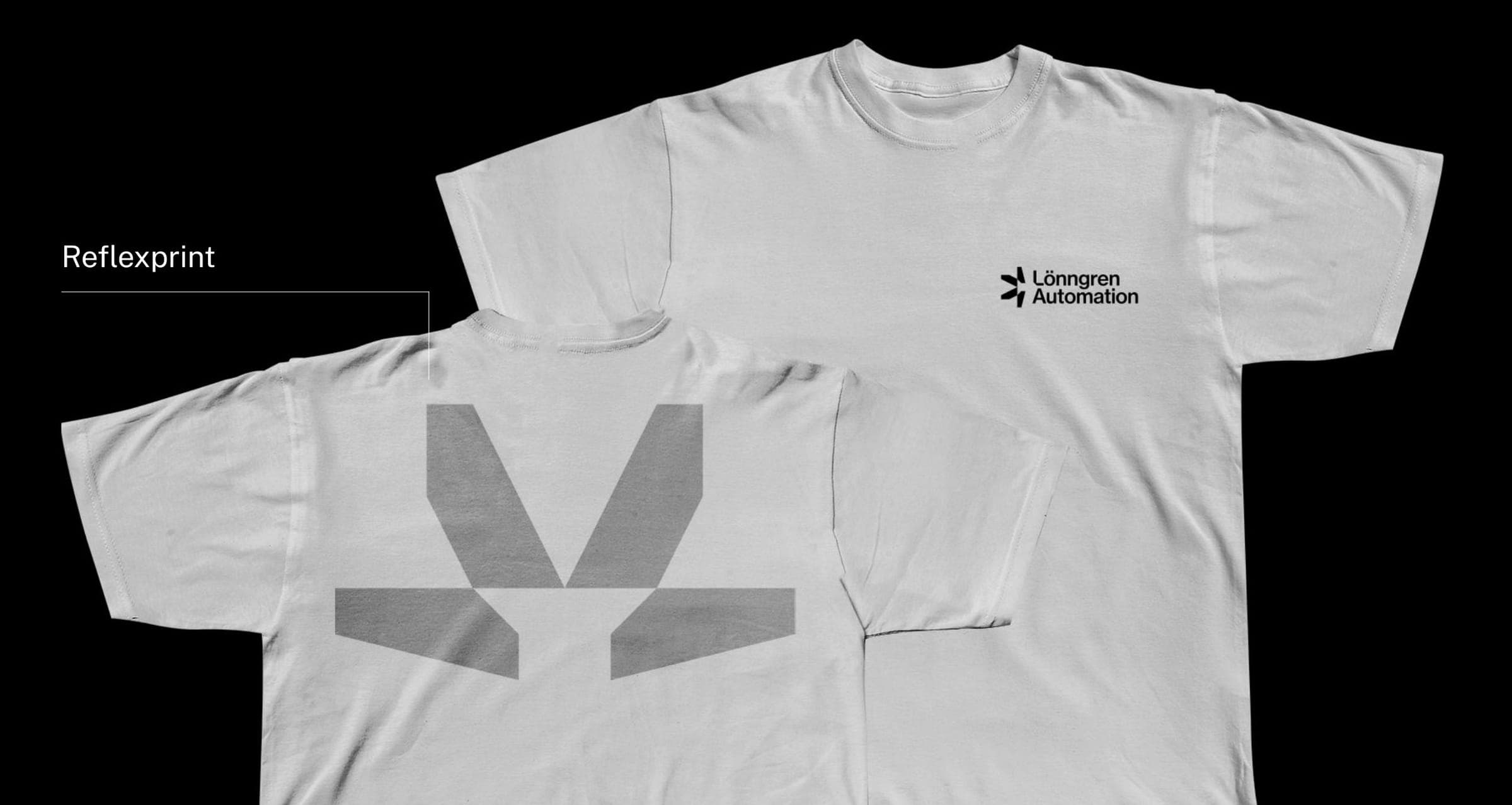
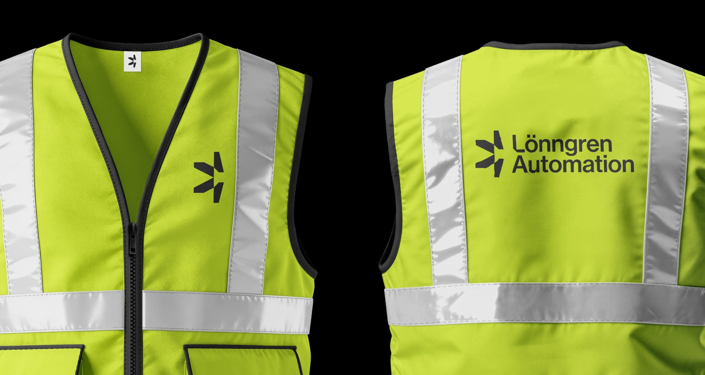
Starting from the L in Lönngren, the letter was abstracted, rotated and multiplied into a single symbol: the points of a maple leaf drawn on the geometry of a gear, with a screw head left in the negative space for the existing assembly the company improves. A clean grotesk wordmark sits beside it, and the identity was shown on caps, hi-vis vests, reflective-print tees, business cards and merchandise.
Outcome
A symbiosis of organic endurance and mechanical precision: a compact, geometric mark that reads at a glance, works in a single colour from embroidered caps to hi-vis vests, and gives Lönngren Automation a confident, recognisable presence wherever its people work.